My logo needs a fat cat holding a cake with a chef's hat and more!
We love when our clients get detailed with us. The more information we have the better we can support them. Recently a client asked us to make:
A fat cat wearing a chef's clothes, holding a piece of pie, and have more deserts around him.This was a nice challenge and as we always do began the process with sketching it out, here is the result of our first sketch:
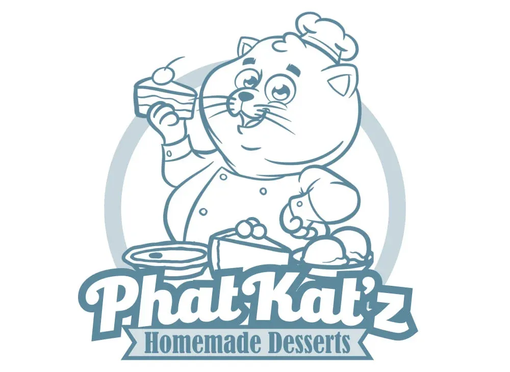
The client immediately loved it but had some minor feedback:
"Bigger hat, bigger smile, less cartoony eyes, and add a tail while you're at it"
The result was:
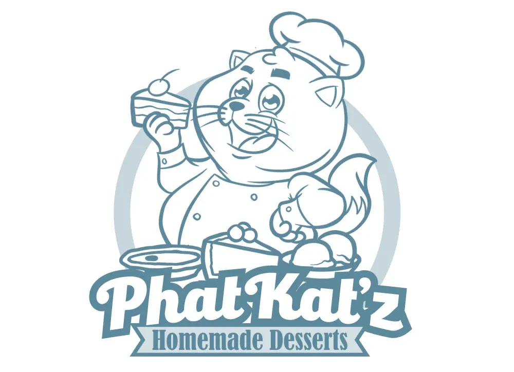
This was a lot closer to what the client wanted but she still felt the cat was a bit too joyful the feedback was:
"Can we make the cat seem a bit more clever and devious looking and the hat not so typical"
Here is what we came up with by making changes to the eyes:
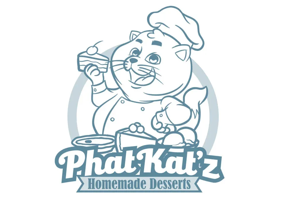
Yes! Yes! Yes! 🙏 ... just a bit more of the same:
"Even more devious and deceptive looking and a fatter tail"
Coming right up ...
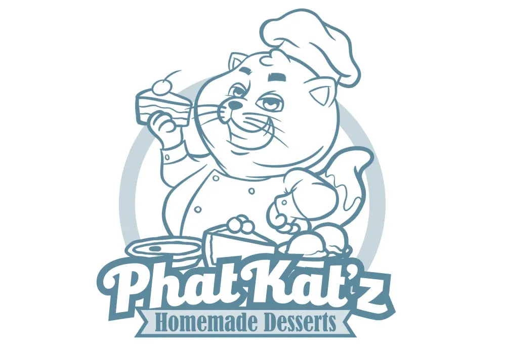
🤩 This was it! A small change in the smile and changes in the eyes and the client was in love! She gave the green light to now bring the logo to life with colors she had chosen.
The final result ... [INSERT DRUM ROLL]:
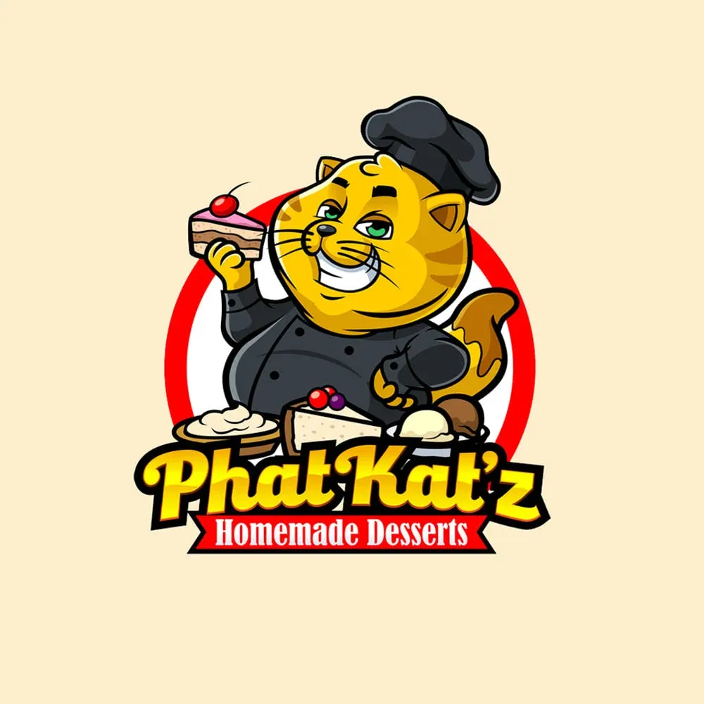
It was perfect! She had an idea in mind and the final result turned out even better. The mascot was unique designed, memorable, and a great representation of what the brand is.
